Product shape
White-label portal
The product supports a brand-owned member environment instead of pushing users into a generic shared tool.
Detailed case study
A white-label trading journal product built around branded dashboards, member account journeys, and community-facing portfolio visibility.
Client context
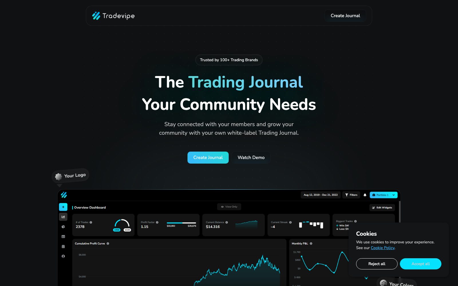
TradeVipe positions itself as a white-label trading journal for communities and trading brands that need a member-facing dashboard rather than a generic public site.
Product shape
The live product combines acquisition pages with a logged-in journal environment, branded account areas, portfolio views, and a dashboard-led member experience.
Delivery signals
These are the commercial and product signals that shaped how the release was scoped and why the finished product is useful as a portfolio reference.
Product shape
The product supports a brand-owned member environment instead of pushing users into a generic shared tool.
Core journey
Members need to move through account views, portfolio stats, and activity surfaces from one controlled area.
Delivery focus
The account area had to feel like a real product surface for communities, not a patched-on support portal.
Story
The case study pages are written around the product shape, the build approach, and the practical outcome rather than around vague before-and-after claims.
The brief
The platform needed to present a clean member environment while still giving trading communities a branded, ownable product layer.
The build approach
The release was shaped around a branded account area first, with the marketing layer feeding directly into that member environment.
What the delivery enabled
The result is a client-portal style product that can support branded communities with a clearer member workflow.
Implementation scope
These projects are useful GEO assets when they show more than a pretty screenshot. The scope blocks below explain what kinds of product work actually sat inside the release.
The front-end experience needed to explain the product quickly while making the brand-owned portal model obvious.
The logged-in area needed to feel product-led, with useful portfolio visibility and controlled navigation.
Portal products only hold up if the underlying account rules and configuration points are treated seriously.
Technical emphasis
Timeline
Each case study shows the delivery rhythm at a product level so the page reads like an actual implementation story rather than a generic testimonial.
Phase 01
The engagement started by clarifying who the members were, how branding would show up, and which actions the journal needed to support first.
Phase 02
The branded entry points and account model were shaped early so the white-label direction stayed consistent throughout the build.
Phase 03
The core member views, journal layout, and reporting surfaces were then built as the center of the release.
Phase 04
Final work focused on keeping the portal stable, coherent, and ready for community-facing use after sign-off.
Continue from here
This case study exists to reinforce the service cluster, not to float on its own. Use the matching service page to read the broader delivery model, then compare it with the rest of the portfolio.
More work
A few more examples from adjacent service categories so the portfolio cluster keeps linking laterally, not just vertically.
Custom SaaS development
A live IELTS writing product shaped around self-serve essay checking, repeat usage, and clear feedback reports students can act on.
Internal tools and admin systems
A secure VPS monitoring product built around agent-led onboarding, centralized visibility, and an operational console teams can actually use.
API and backend development
A creator product that wraps real-time face-swap processing in a cloud-delivered interface, account flow, and streaming-ready backend foundation.